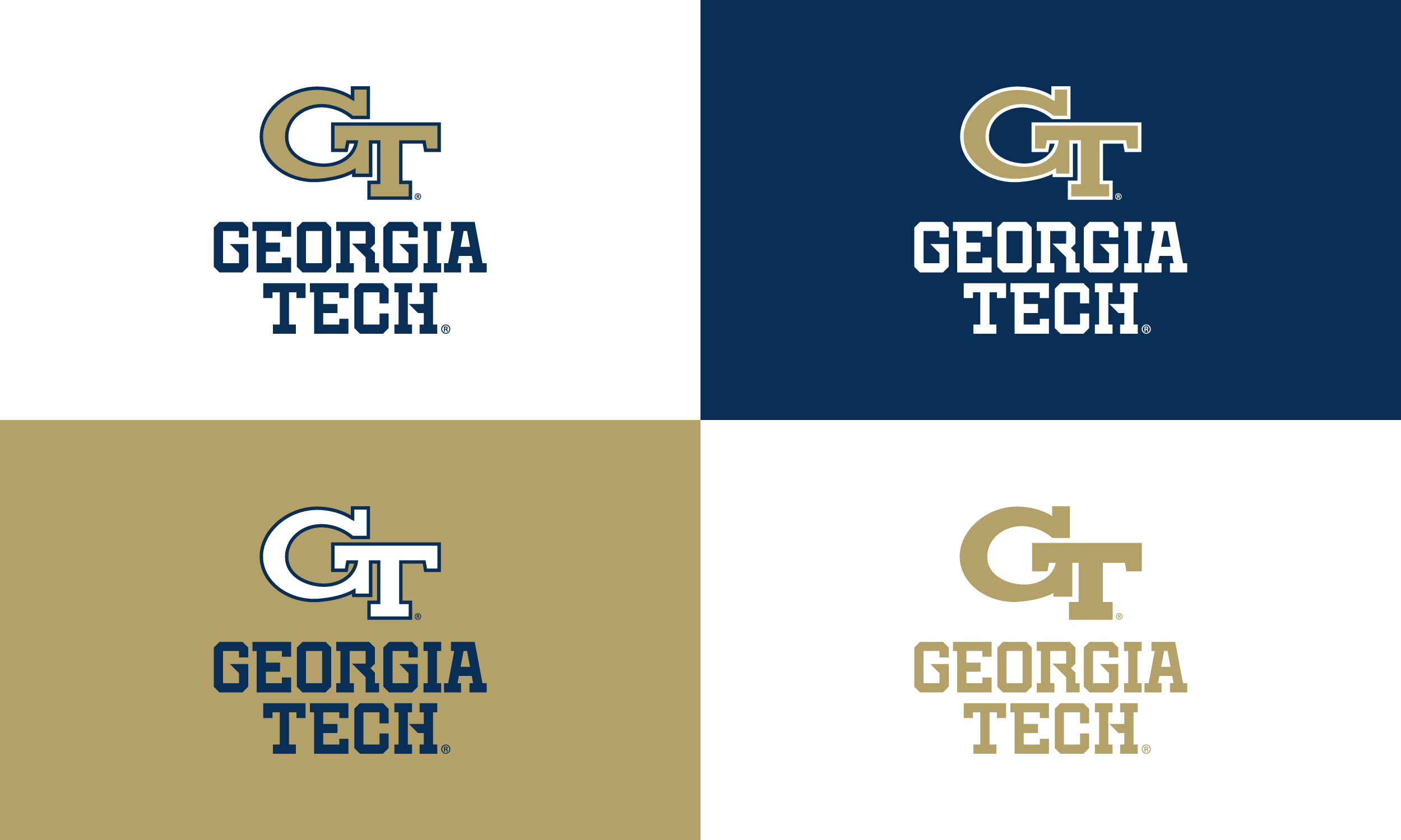
Georgia Tech Athletic Wordmark
Goal: To create a new official wordmark that aligned every athletic team on campus under one identity. Georgia Tech Athletics wanted a brand that felt consistent, modern, and recognizable, while also giving fans a stronger connection and improving the program’s marketability.
To meet that need, we designed a custom wordmark that is simple, bold, and instantly recognizable. The custom typeface features unique “stingers” crafted as a nod to Georgia Tech’s history and traditions, adding a layer of meaning to the design while keeping it fresh and contemporary.
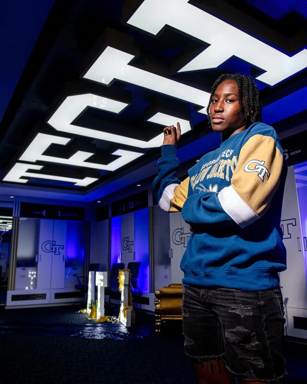
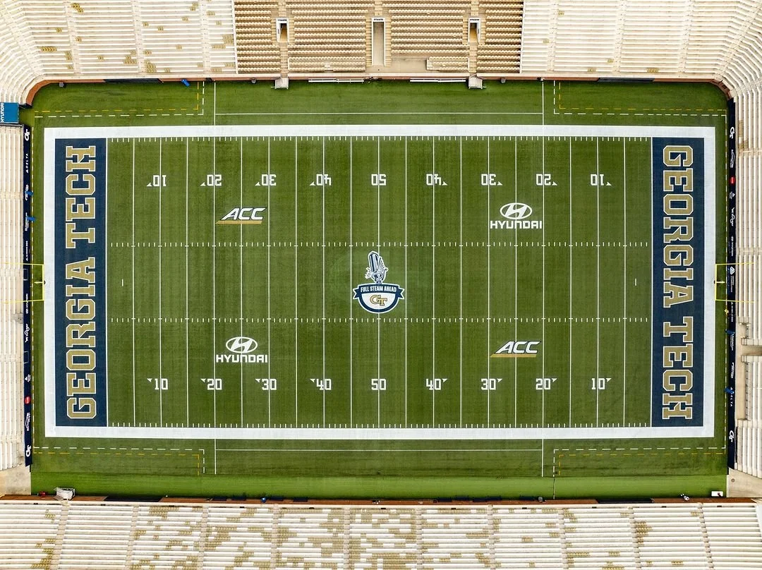
The new wordmark was quickly embraced by both fans and the athletics community. It now appears across uniforms, facilities, merchandise, social media, and promotional video content. This consistent application has strengthened the Georgia Tech Athletics reputation, built a stronger sense of unity across all teams, and given fans a brand they take pride in representing.
The initiative delivered on its goals, establishing a modern identity that boosted recognition, marketability, and pride in Georgia Tech Athletics.
Scope: Creative Direction, Custom Typography, Custom Numeral Set, and Brand Identity
Photography: Provided by Georgia Tech Athletics
All collegiate logos were created while employed at CLC and are the property of those respective universities.